MONARCH BREWING

Packaging Design & Branding

The Challenge

To build an imaginary beverage product, determine its name, create flavors, and establish its packaging. The brand should have several different flavors and their different labels should be cohesive as a single brand. To do this, a theme, story, or style can be established.

Target Audience

The target audience for this project is people first who love beer. They are both male and female ages 21-50 and always love to try new things. They are social drinkers and love the comradely that comes along with having a few beers with some great friends. They enjoy campfires and spending time with their family and friends. They like to cook and have a refined palette.

Discovery & Exploration

I wanted to create a beer that emphasized the experience that comes along with friends hanging out and sharing a few drinks together. Beer brings people together and I want this brewing company to highlight the values of friendship. I decided to call the brewery monarch brewing co because of the butterfly. Monarchs usually migrate alone but when they reach their destination they are greeted by their fellow butterfly friends. They rely on their fellow butterflies for protection and also for warmth. This reminded me of human nature. Humans may travel alone and have responsibilities in life but when they come home their friends and family are always there to welcome them and usually enjoy a few beers. I want this design to invoke the relationship between beer and friends as a melded unit that brings people together.

Moodboard

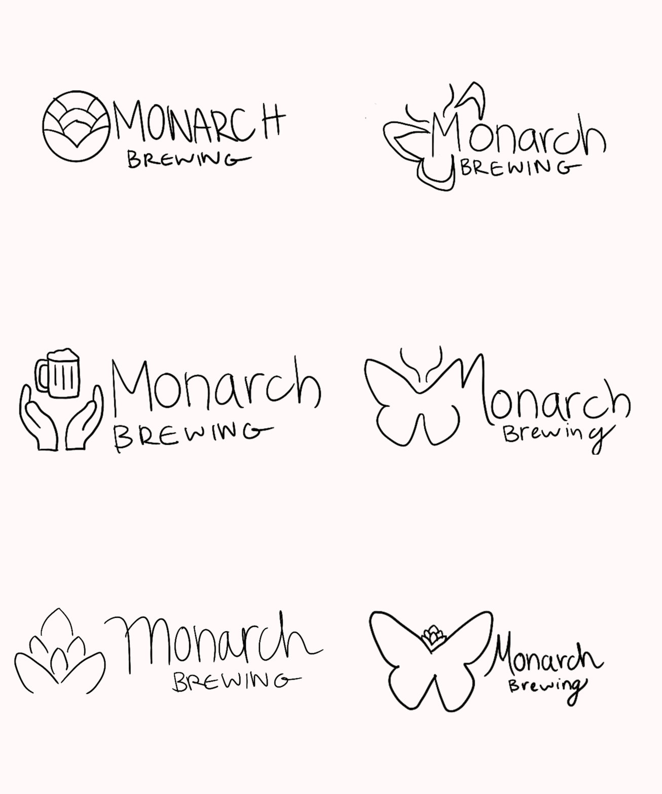
Sketches

Round 1 Drafts

In my first round of drafts, I wasn't very thrilled with any of my options. In option 1 I tried to combine a monarch with a hops flower but I don’t think it translates that well and people may be confused by it. In option 2 I don’t think the typeface is working well with the line quality of the butterfly and there isn’t enough hierarchy. For option 3 I did like the typeface I chose here but the half butterfly

Option 1

Option 2

Option 3

Round 2 Drafts

In my second round of drafts I think option 2 is working well here. I created the leaves from hops flower shapes and combined it with the typeface I used in the previous round. I think the work together well and I can also use just the”M” with the leaves as a submarket. As for option 1 I wanted to try a more handwritten style but it just ended up looking like a child’s bookstore sign so I decided not to move forward with it.

Option 1

Option 2

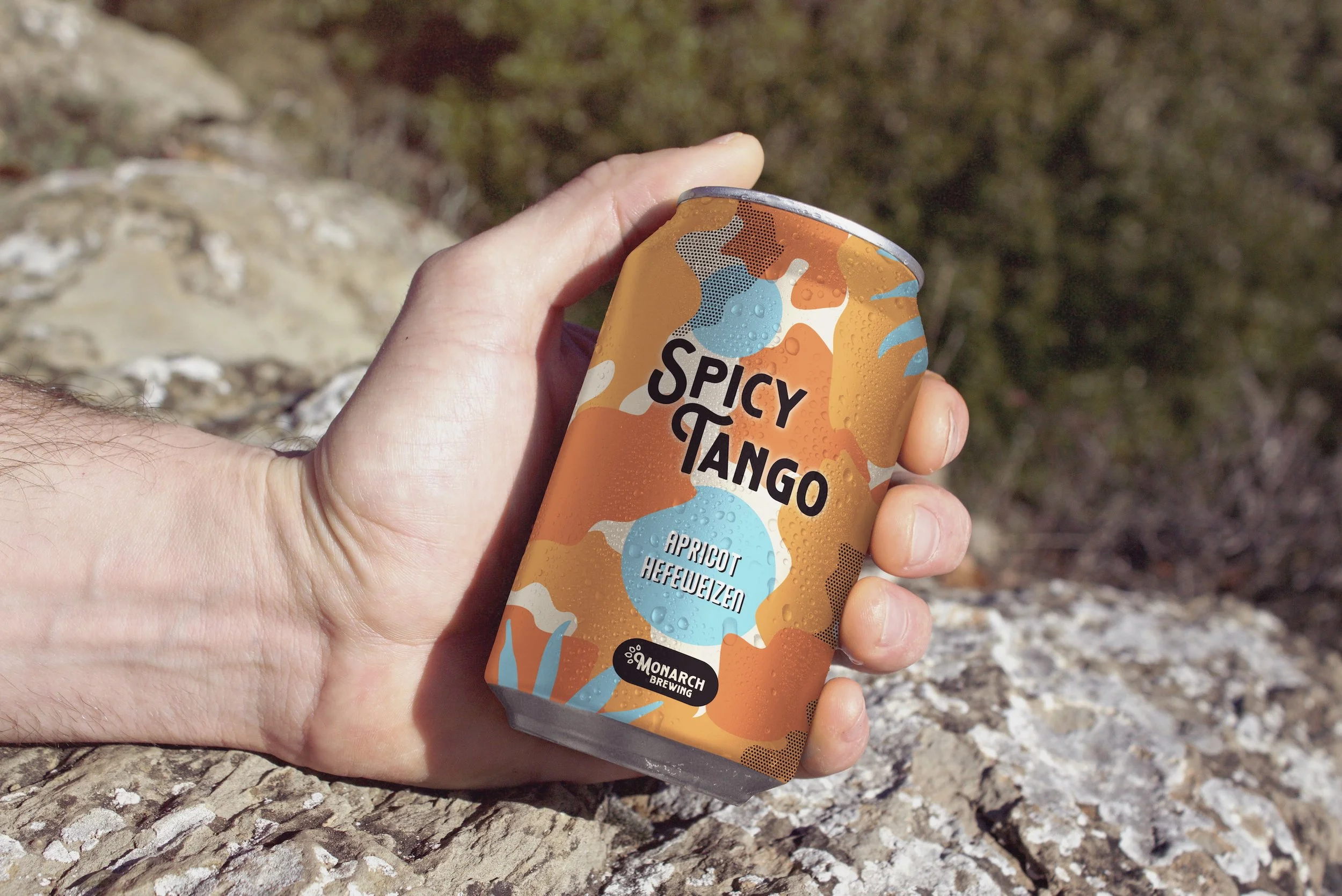
Final Design

Reflection

This was one of my favorite projects to work on and I was very happy with the result. I think I did a good job of portraying the message I hoped to send in a more abstract way. I think it would be great to expand this design even further and create more varieties.

Previous
Previous

Personal Branding

Next
Next

Centered